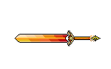
Sprite Designs... (EDIT: 2-24-15)
D.ChaosMS Forum :: Community :: Graphics
Page 1 of 1 • Share
- iKhat
Newbie
- Posts : 7
Points : 30
Reputation : 7
Join date : 2015-02-06
 Sprite Designs... (EDIT: 2-24-15)
Hello Everyone OLD AND NEW!!!!
I've been really improving on my craft of spriting (3.5 years and counting).
I hope my sprites here today exhume this very endeavor.
(Deleted previous posts to condense it into this post...)
So I need some Harsh CnC on these sprites, If you would do so kindly.
-------------------------------------------
[NEW SPRITE]: Lunar Dagger, and Scarlet (Revamped) (2-24-15)
-------------------------------------------
Lunar Blade:

Scarlet (Named by: Aniki) (Revamped)

-------------------------------------------
Previous:
-------------------------------------------
[Note]: I know some of them you've already seen...but w/e.
Anyway here are the sprites:
Please ENJOY!!
I've been really improving on my craft of spriting (3.5 years and counting).
I hope my sprites here today exhume this very endeavor.
(Deleted previous posts to condense it into this post...)
So I need some Harsh CnC on these sprites, If you would do so kindly.
-------------------------------------------
[NEW SPRITE]: Lunar Dagger, and Scarlet (Revamped) (2-24-15)
-------------------------------------------
Lunar Blade:

Scarlet (Named by: Aniki) (Revamped)

-------------------------------------------
Previous:
-------------------------------------------
[Note]: I know some of them you've already seen...but w/e.
Anyway here are the sprites:
- Sprite Designs:
- 1. Holy Blade (Recent Creation)

2. Daybreak Blade (Name by: Knives)
3. Cognitive Staff
4. Frozen Fate
5. Royal Spear
Please ENJOY!!
Last edited by iKhat on Tue Feb 24, 2015 10:03 pm; edited 5 times in total (Reason for editing : Revamped Scarlet Spear Sprite and Added another sprite)
- Fate
Donator

- Posts : 66
Points : 97
Reputation : 7
Join date : 2012-06-25
Age : 27
 Re: Sprite Designs... (EDIT: 2-24-15)
The bottom of the post has nicer stuff to say. These were my initial, very picky, thoughts.
Holy blade's guard is very hard to see clearly, hopefully due to the yellow on white but it could also have to do with the thin yet busy design.
You seem to favor the glow effect on the weapons, just remember that not all weapons have to glow. I have nothing against it but it can get old after a while.
Scarlet's blade seems a bit wide, almost like it was Frozen Fate to begin with then transitioned into a spear. Maybe it's just seeing the two at the same time that causes this for me but I can't unsee it now lol.
Frozen Fate seems like it should be a 2-Handed weapon, which is fine, but the hilt may be too short for that with the curved guard that it has. Emphasis on may as it could be just fine.
Daybreak Blade's blade seems too wide for its length. Also the zigzag on the hilt doesn't seem that needed for the look of the weapon, but it may look strange without it. Just something to check out. After zooming in, it does look good so maybe just leave it? idk
I surprisingly like the Staff after looking at it for a while so not much to say about that.
One last thing, why are the outlines on Frozen Fate and Scarlet so thick? Specifically Frozen Fate since it seems more like a chunk of ice than a blade, making it into a blunt weapon.
All of that being said, those were very nitpicky comments and all of these seem very well done. My favorite was probably Holy Blade.
I was a little disappointed in the lack of green though.
0/10 -Fate "Not green enough."
- Kira
Member

- Posts : 17
Points : 31
Reputation : 0
Join date : 2014-12-19
 Re: Sprite Designs... (EDIT: 2-24-15)
they look really gradient.
Well, there is only so much you can do with a design like that.
Well, there is only so much you can do with a design like that.
 Similar topics
» Cyn's first ever Edit set.
» My First Sprite Ever! :D
» I sprite 4 u!!!11
» My 2nd Sprite! :D (WIP)
» my edit...
» My First Sprite Ever! :D
» I sprite 4 u!!!11
» My 2nd Sprite! :D (WIP)
» my edit...
D.ChaosMS Forum :: Community :: Graphics
Page 1 of 1
Permissions in this forum:
You cannot reply to topics in this forum
 Home
Home Latest images